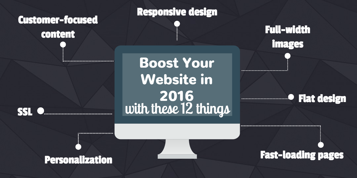
Want your website to rock this year? Your 2016 New Year’s resolution may be long forgotten, but it’s not too late to start making changes to improve your website. When it comes to websites and web design, 2016 is all about simplicity and user experience.
Whether you’re thinking about a full-on web redesign or just a few quick updates, see if your website has what's on this list.
1. Customer-focused content
Your website should serve your users, not just be all about you and the product or service you offer. The purpose of your website is to support users through their buyer’s journey. Instead of emphasizing your greatness, identify your users’ pain points and offer a solution.
2. Personalization
One of the best ways to bring relevant content that supports users through the buyer’s journey is personalization or smart content. What if you could show visitors different content based on their location, referral source, device, persona, or list membership? Think how relevant your content would be then and how much you could improve your user experience.
3. Responsive design
This comes as no surprise—people are on the go and on mobile. They’re on their phones and tablets. Google recognizes the importance of mobile-friendly websites and says it will rollout effects that boost an algorithm favoring mobile in May. Is your website ready to accommodate that? In the beginning of the mobile revolution, companies were developing one website for desktop and another for mobile. Now, it’s all about flexibility. Make a website that can respond to any size screen or type of device.

4. Flat design
It’s been a long time coming. Drop shadows and flashy graphics are out—and flat design is in. The minimalist look is trending everywhere you turn, even in web design. But that doesn’t mean it has to be boring.
5. Full-width images
People are visual. We scroll through Instagram a dozen times a day for a quick glance at image after image. Our brains quickly translate images into information in our brains. Images tell stories and say a lot about your company. Your website needs high-quality, dramatic yet minimalist images (not those cheesy stock photos!). Thankfully, there are a plethora of websites offering free, hi-res stock photos. (that don’t even look like stock photos!)
6. Video
More and more companies are utilizing video to engage their audiences. Like images, video takes it up a notch with visual engagement and storytelling. Video hosting platforms like Wistia make it easy for businesses to use video as a marketing tool. If you're a HubSpot user, check out the Wistia integration.
7. Super nav
A super nav is what we like to call the navigation menu that sits above the main navigation. It usually contains two to three main menu links that your users would need for quick access. Typically, these include links to Login, Contact, or Support pages. We are trained to look in the top corner for the link we need to access our profile or get in touch with a company. Help your website visitors and customers alike with a quick link right where they expect to find it.
8. Fast-loading pages
Slow loading pages can affect your SEO and bounce rate. The use of technology has shortened our attention spans. If a page doesn’t load at lightning speed, we’re on to the next website.

9. SSL
SSL, or Secure Sockets Layer, encrypts the connection between your users and your web server. This keeps information secure as it’s transferred between a user and a website, like a login password or credit card number. Additionally, sites with SSL certificates make Google happy. They announced back in 2014 that SSL contributes to site ranking.
10. Quick and easy opt in
Building an email list is an important part of inbound marketing. Converting visitors into leads is a beginning step in moving visitors through the funnel. Want people to follow your blog? Don’t make it more complicated than it is. Want people to download an ebook? Keep it simple. Have a blog opt-in module in your blog sidebar and in the footer of your website. As a visitor moves throughout your website and scrolls around you blog, they don’t have to wait until a CTA at the end of a post to have the chance to subscribe.

11. Reports
This isn’t on your website, per se, at least this part isn’t something that your users see directly when they come across your site. But reports and data about your website is important in growing and improving your website and user experience. You need to know why you’re doing what you’re doing. What’s working? What’s sinking? Reviewing reports of your website data will change the way you strategize and deliver.
12. Quality, shareable content
It doesn’t matter how great your design is or what kind of security you have. If your content isn’t relevant and high-quality, who cares? Don’t create content to fill a page or rank on a keyword. This is about your customers, remember? Create valuable, relevant content that helps answer a user’s question and solves a problem. Create content that’s worth sharing because it adds value, not just edgy or full of buzzwords.
Don’t just take our word for it. Test what works for your buyer personas, website users, and business. Use data to drive your website and improvements you make to it.
Learn more about the web design strategy that is revolutionizing the way we look at our websites. Read our ebook: Intro to Growth-Driven Design. Download your copy now!


