Content Creation Tools that Have Changed the Way We Work

 Since our agency was founded in 2012, there has been a ton of change in the world of inbound marketing. What was once a brand new way to market a product or service has now become ubiquitous. It’s no longer enough to just throw together a blog post here and there; content creation has to be the central focus, or no other aspect of the process can be a success.
Fortunately, the rise of content-focused marketing has coincided with the development of some seriously amazing time-saving tools to help with the content creation process. From the beginning steps of planning all the way through to development, editing, publishing, and repurposing, we have found tools that make our jobs easier. Here are the six we’re most excited about right now:
Trello:
If you’re not using Trello with your team to manage projects, you’re probably making things much harder on yourself than you need to! We’ve tried a variety of other tools to manage a content calendar for our own site and those of our clients, and this one is hands-down the most intuitive one to figure out.
We use Trello by creating a board for each of our clients, and one for our own blog. Within each board, we have multiple lists to indicate where each task is on the road to completion. Within each list are cards; one for each task (or in our case, piece of content). It’s easy to drag cards from one list to another to show everyone on the team where we are in the content creation process. For instance, the blog post you’re reading right now started in a “parking lot” list, and then moved to an “in development” list, then “in review” and then “published.”
Our team has loved how graphic and scannable the boards are, and we have recently started using them as a replacement for a more traditional content calendar. Since cards have a due date function, and can be assigned to specific team members, it’s easy to see what each person is responsible for and how close to completing their tasks on time they are.
Slack:
Slack is our chosen team communication app, because it’s got so many great functions that make our jobs easier and more fun. Our whole team has the app installed on laptops and iPhones so we can give status updates during the workday or on the go. Just like Trello, we create different “channels” for each client. This keeps our messages in a focused and easy-to-search place, and makes sure that not all teammates are being messaged if an update doesn’t apply to them.
It also has tons of integrations, including Trello and Google Drive, that make it work well with other apps. The Trello integration sends a notification to the appropriate team members any time a card has been moved from one list to another, and the Google Drive integration allows us to easily share files with each other. Any file that needs frequent revisiting can be “pinned” in their channels so they’re easier to find for reference.
Beyond the impressive functional aspects, Slack is just plain fun to use. Emoji and a Giphy integration make for some entertaining responses to messages. We love sending reaction GIFs to each other’s messages throughout the day. Giphy has come up with some pretty hilarious options for us before, which always adds a little humor to our process.
Hemingway:
A piece of written content is only as good as its editing. If an article is full of great thoughts but riddled with grammatical errors or overly-complicated sentences, it becomes unreadable. For the task of editing, we couldn’t possibly love the ease of Hemingway more. Generally, when I’m provided with a piece of content written by someone else, I’ll take a quick pass through it in Pages or in Google Docs for anything that jumps out at me, and then I copy and paste the entire thing into Hemingway.
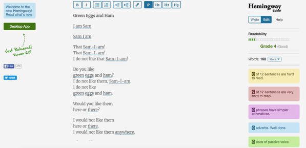
This is where the magic happens. Hemingway gives a readability score at the top right and highlights adverbs, hard to read (or very hard to read) sentences, uses of passive voice, and any time that a word choice could be simpler. I usually edit within the tool and then copy and paste the now-polished version back into the HubSpot COS to format and publish. Hemingway has saved hours of staring at a screen thinking “this is such a weird sentence, but I’m not sure how to make it better.”
Snappa:
Snappa has been one of the best time-saving tools we’ve started using in the last year. It’s incredibly easy to use, and helps us create professional-looking graphics in no time. Once we’ve created and/or edited written content, we use Snappa to make images before publishing.
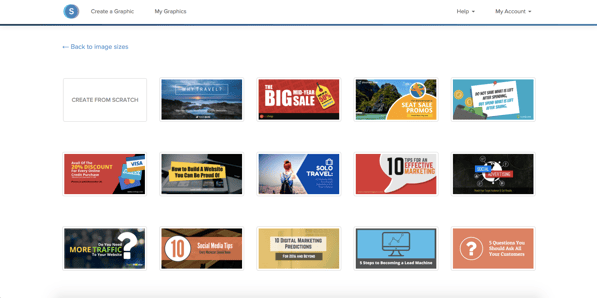
Because the templates are so sleek by default, we usually start with an existing template (see some of them above) and make changes as needed. The selection of graphics, stock photos, and available fonts is truly impressive, and has allowed us to change and polish images to look like we paid a graphic designer for a custom visual. Even for those not using the tool, the Snappa team has provided free access to the beautiful stock photo selection at stocksnap.io.
HubSpot:
We use HubSpot for much more than just content creation. In fact, we basically use it for just about anything you can imagine. But the HubSpot COS makes publishing and optimizing content such a simple and user-friendly process. Optimizing and automatically sharing our content via email with our subscriber list is a snap, as is promoting it on social media.
Beacon:
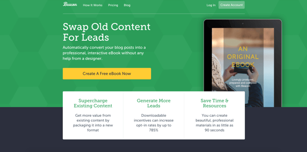
Beacon is the newest tool in our arsenal, but it has quickly proven itself indispensable for us. We use it to repurpose blog content into beautiful ebooks. The tool connects with HubSpot to pull in all of the blog posts on any client’s blog (or our own). From there, we can easily designate which ones we want to combine to make an ebook using check boxes. Reordering and editing the posts is a snap, as is adding new pages.
The second they’re combined, they already look remarkably professional, but customizing the color schemes and fonts and adding images—by using their selection of stock photos and illustrations, or by uploading your own— makes them fit whatever brand you’re working with. There are several layout options for every page type, including a CTA page that can lead to whatever landing page you want. It’s surprisingly intuitive and quick to create something beautiful using this tool.
Using all these tools, we’ve been able to create content much faster, and to make more polished work for ourselves and our clients. We’re excited to see how our processes improve from using all these resources in unison in the next few months. Are there any new tools your agency or marketing department has loved?
Table of Contents
Related Posts

Content Creation Tools that Have Changed the Way We Work


